Note
Go to the end to download the full example code.
3. PAC Cycle Feature Distributions
Compute bycycle features for simulated phase-amplitude coupled (PAC) data.
Import packages
First let’s import the packages we need. This example depends on the pactools simulator to make pac and a spurious pac function from the pactools spurious pac example.
import numpy as np
import matplotlib.pyplot as plt

from pactools import simulate_pac, Comodulogram
from pactools.utils.pink_noise import pink_noise

from neurodsp.plts import plot_time_series
from neurodsp.sim import sim_oscillation
from neurodsp.utils.norm import normalize_variance

from bycycle import BycycleGroup
from bycycle.plts import plot_feature_hist
Simulate PAC data
Now we will use the imported functions to make pac data, spurious pac data and a sine wave with pink noise.
n_seconds = 20
fs = 200.  # Hz
n_points = int(n_seconds * fs)

f_beta = (14, 28)
high_fq = 80.0  # Hz; carrier frequency
low_fq = 24.0  # Hz; driver frequency
low_fq_width = 2.0  # Hz

noise_level = 0.25

# Simulate beta-gamma pac
sig_pac = simulate_pac(n_points=n_points, fs=fs, high_fq=high_fq, low_fq=low_fq,
                       low_fq_width=low_fq_width, noise_level=noise_level)

# Simulate 10 Hz spiking which couples to about 60 Hz
spikes = sim_oscillation(n_seconds, fs, 10, cycle='gaussian', std=0.005)
noise = normalize_variance(pink_noise(n_points, slope=1.), variance=.5)
sig_spurious_pac = spikes + noise

# Simulate a sine wave that is the driver frequency
sig_low_fq = sim_oscillation(n_seconds, fs, low_fq)

# Add the sine wave to pink noise to make a control, no pac signal
sig_no_pac = sig_low_fq + noise
Check comodulogram for PAC
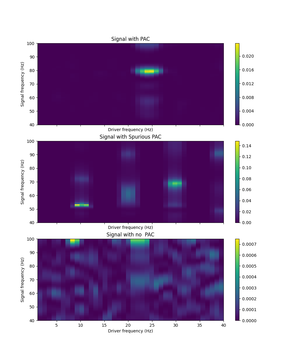
Now, we will use the tools from pactools to compute the comodulogram which is a visualization of phase amplitude coupling. The stronger the driver phase couples with a particular frequency, the brighter the color value. The pac signal has 24 - 80 Hz pac as designed, the spurious pac has 10 - 60 Hz spurious pac and the final signal has no pac, just background noise.
fig, axs = plt.subplots(nrows=3, figsize=(10, 12), sharex=True)
titles = ['Signal with PAC', 'Signal with Spurious PAC', 'Signal with no  PAC']
for sig, ax, title in zip((sig_pac, sig_spurious_pac, sig_no_pac), axs, titles):

    # Check PAC within only channel; high and low sig are the same
    #   Use the duprelatour driven autoregressive model to fit the data
    estimator = Comodulogram(fs=fs, low_fq_range=np.arange(1, 41), low_fq_width=2.,
                             method='duprelatour', progress_bar=False)

    # Compute the comodulogram
    estimator.fit(sig)

    # Plot the results
    estimator.plot(axs=[ax], tight_layout=False, titles=[title])
Plot time series for each recording
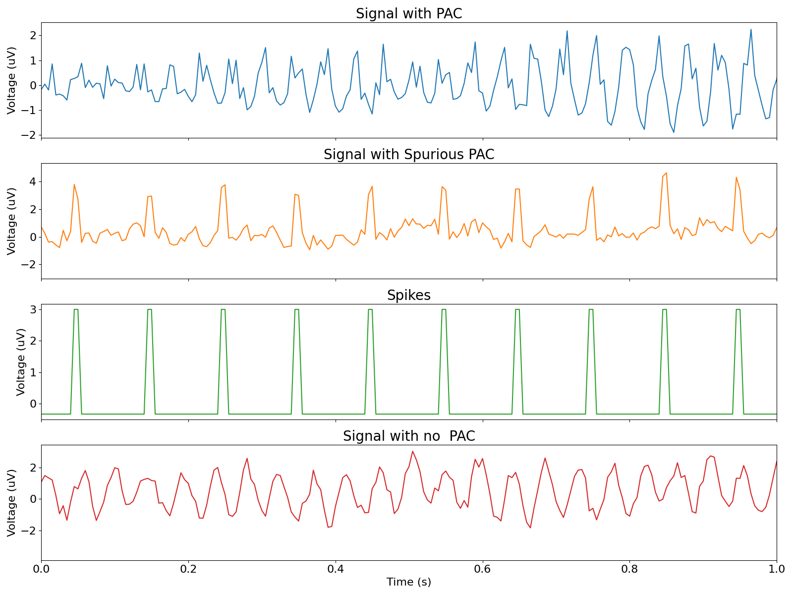
Now let’s see how each signal looks in time. The third plot of spikes is added to pink noise to make the second plot which is the spurious pac. This is so that where the spikes occur can be noted in the spurious pac plot.
time = np.arange(0, n_seconds, 1/fs)

fig, axes = plt.subplots(nrows=4, figsize=(16, 12), sharex=True)
xlim = (0, 1)

# Plot PAC
plot_time_series(time, sig_pac, title=titles[0], xlabel='', colors='C0', ax=axes[0], xlim=xlim)

# Plot spurious PAC
plot_time_series(time, sig_spurious_pac, title=titles[1], xlabel='', colors='C1', ax=axes[1], xlim=xlim)

# Plot spikes
plot_time_series(time, spikes, title='Spikes', xlabel='', colors='C2', ax=axes[2], xlim=xlim)

# Plot signal with no PAC
plot_time_series(time, sig_no_pac, title=titles[2], colors='C3', ax=axes[3], xlim=xlim)
Compute cycle-by-cycle features
Here we use the bycycle the BycycleGroup` class to compute the cycle-by- cycle features of the three signals.
# Set parameters for defining oscillatory bursts
thresholds = {
    'amp_fraction_threshold': 0.3,
    'amp_consistency_threshold': 0.4,
    'period_consistency_threshold': 0.5,
    'monotonicity_threshold': 0.8,
    'min_n_cycles': 3
}

sigs = np.vstack([sig_pac, sig_spurious_pac, sig_no_pac])

bg = BycycleGroup(thresholds=thresholds, center_extrema='trough', return_samples=False)

bg.fit(sigs, fs, f_beta)

dfs = {
    'pac': bg.df_features[0],
    'spurious': bg.df_features[1],
    'no_pac': bg.df_features[2],
}
Plot feature distributions
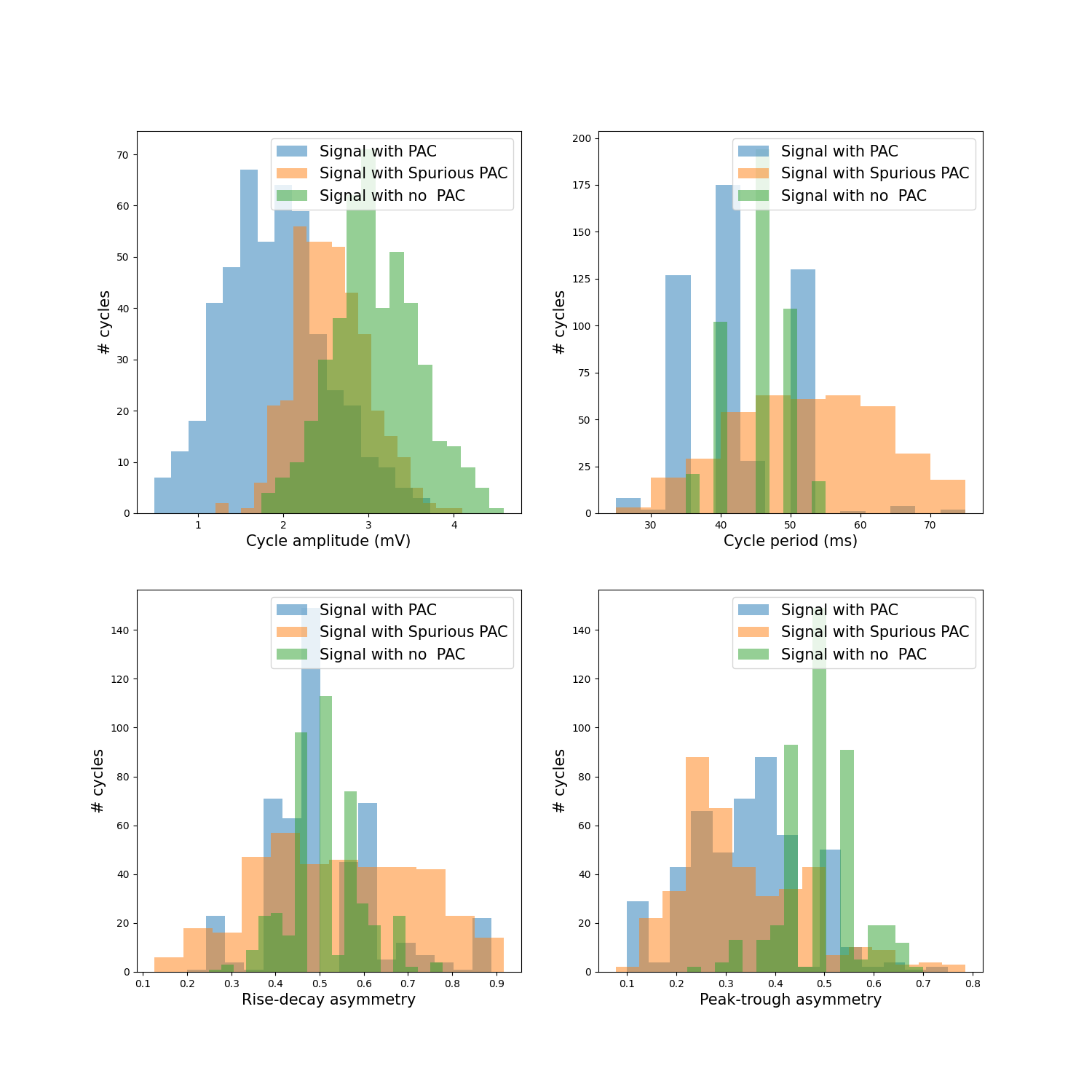
As shown in the feature distributions, the pac signal displays some peak- tough asymmetry as does the spurious pac signal.
fig, axes = plt.subplots(figsize=(15, 15), nrows=2, ncols=2)

for idx, key in enumerate(dfs):

    # Rescale periods
    dfs[key]['period'] = dfs[key]['period'] / fs * 1000

    # Plot feature histograms
    plot_feature_hist(dfs[key], 'volt_amp', only_bursts=False, ax=axes[0][0],
                      label=titles[idx], xlabel='Cycle amplitude (mV)', )

    plot_feature_hist(dfs[key], 'period', only_bursts=False, ax=axes[0][1],
                      label=titles[idx], xlabel='Cycle period (ms)')

    plot_feature_hist(dfs[key], 'time_rdsym', only_bursts=False, ax=axes[1][0],
                      label=titles[idx], xlabel='Rise-decay asymmetry')

    plot_feature_hist(dfs[key], 'time_ptsym', only_bursts=False, ax=axes[1][1],
                      label=titles[idx], xlabel='Peak-trough asymmetry')
Total running time of the script: (0 minutes 1.667 seconds)